Ember & Vine
Ember & Vine needed a digital presence as warm and inviting as their dining room. The site had to evoke the wood-fired, handcrafted ethos of the restaurant — dark, intimate, and unmistakably premium. No generic restaurant template. Every detail, from the typography to the color palette, needed to feel like candlelight on a mahogany table.
Setting the mood
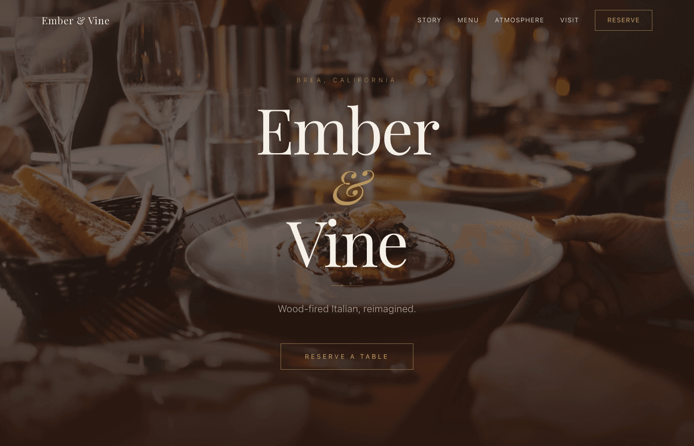
The hero needed to feel like walking through the front door — warm light, the scent of oak smoke, a sense of occasion. We layered a full-bleed culinary photograph beneath a dark overlay, letting the serif wordmark 'Ember & Vine' breathe in gold and cream. The italic ampersand, the wide tracking on 'Brea, California,' the single CTA — every element is deliberate restraint. The page loads and you already know: this isn't a chain restaurant.
Appetite by design
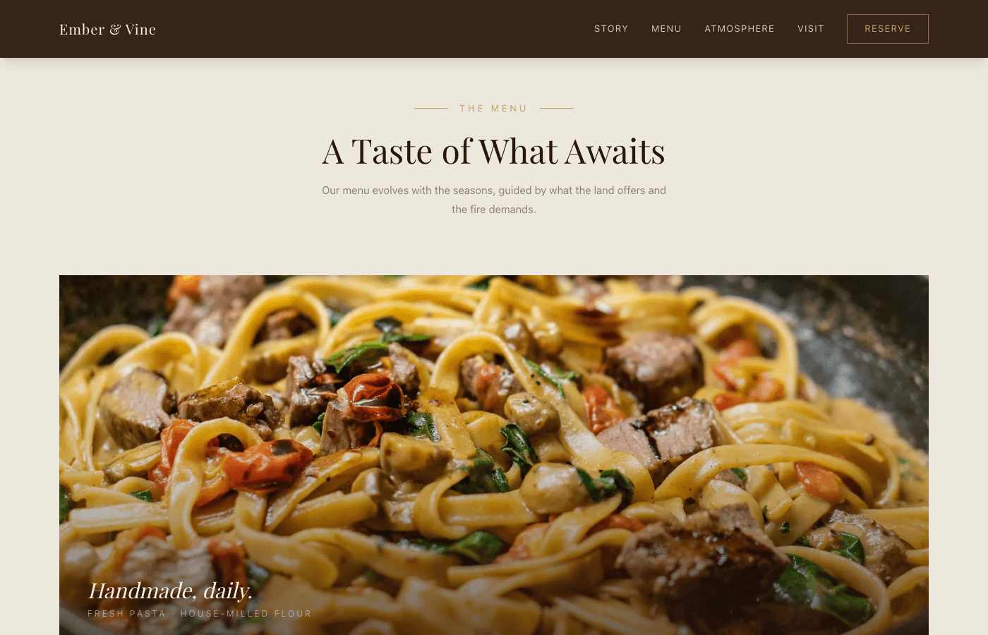
The menu section opens with a cinematic hero image of handmade pasta, then breaks into a four-column card grid — Antipasti, Pasta, Secondi, Dolci — each with its own photo and dotted-leader pricing. The layout mirrors an actual printed menu but adds hover interactions and responsive stacking on mobile. Seasonal language ('guided by what the land offers') keeps it feeling alive, not static.
Soul behind the flame
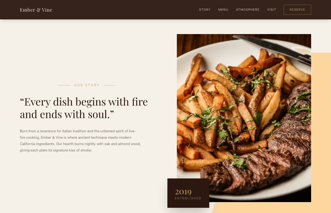
We designed the story section as a two-column split — editorial copy on the left, a tall chef portrait on the right — with a floating 'Established 2019' card anchoring the brand's history. The pull quote ('Every dish begins with fire and ends with soul') does the heavy lifting. No mission statement jargon, no corporate voice. Just conviction, set in a large serif italic that demands to be read aloud.
Atmosphere you can feel
This is the most cinematic section of the site. A dark overlay on a candlelit photograph frames three massive serif words stacked vertically — Candlelight. Conversation. Craft. — in alternating cream and gold. The right column offers poetic supporting copy and three minimal detail tags (Oak & Almond, Seasonal Menu, Natural Wine). It's a mood board disguised as a webpage.

The final invitation
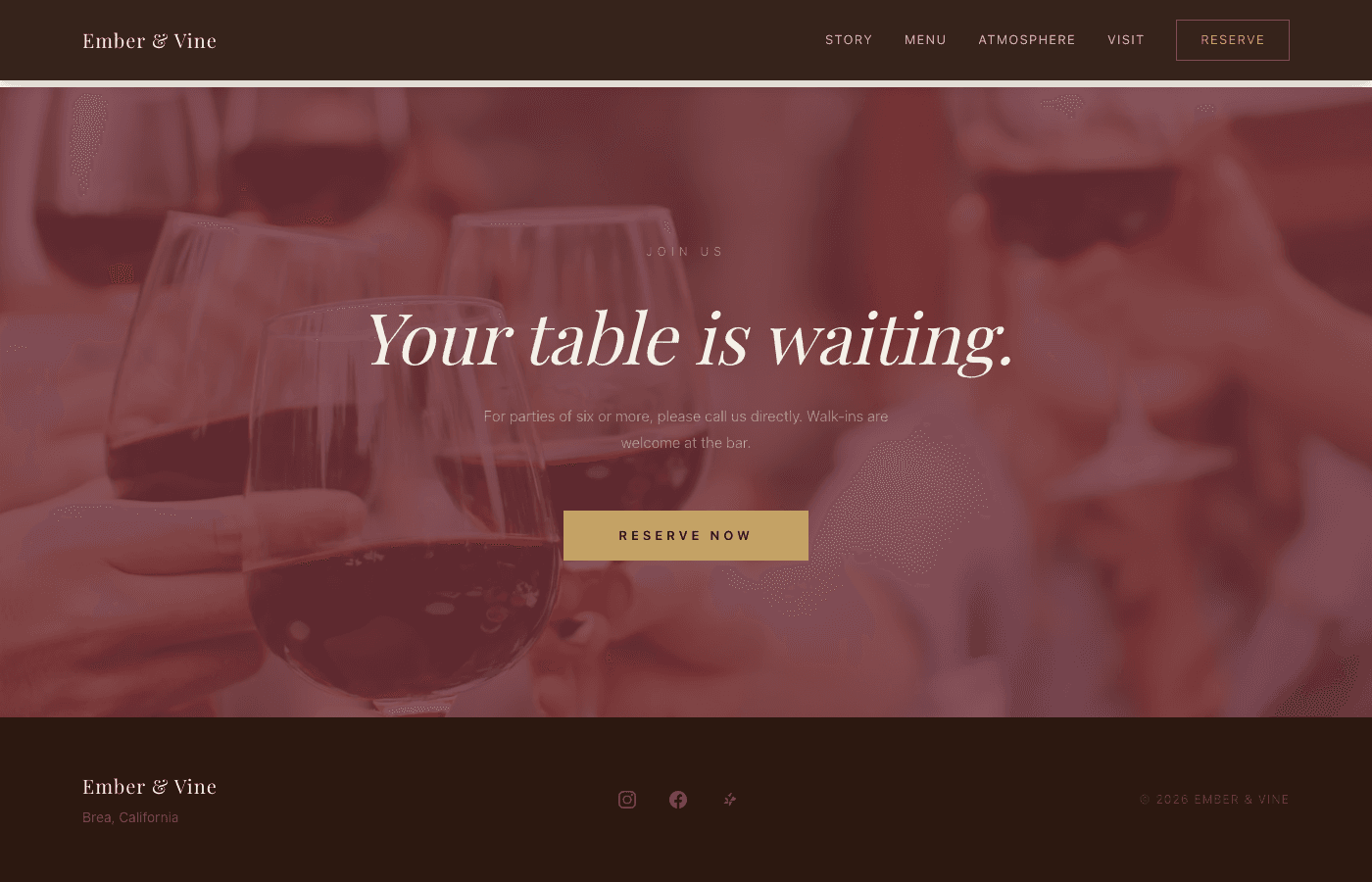
The reservation CTA is built as a full-bleed section with a wine-toned overlay on warm photography. 'Your table is waiting' in large serif italic centers the eye, with a prominent gold 'Reserve Now' button linking to Resy. Below it, the footer keeps things clean — the wordmark, location, social links, and nothing else. The entire page funnels to this moment.
What we delivered
- Full custom Next.js restaurant site launched in 1 day
- Mobile-responsive design with dark, editorial aesthetic
- Integrated reservation system and contact forms
- Custom typography and brand color system
- SEO-optimized with rich imagery throughout
See it live
Explore the full Ember & Vine experience.