Sage & Stone
Sage & Stone wanted a website that felt like an extension of their studio — grounded, warm, and intentional. The site needed to capture the Santa Monica beach yoga energy while communicating class details, pricing, and community. Every design choice, from the earthy terra cotta palette to the flowing Cormorant Garamond headings, was chosen to make visitors feel the calm before they even step onto the mat.
Setting the tone
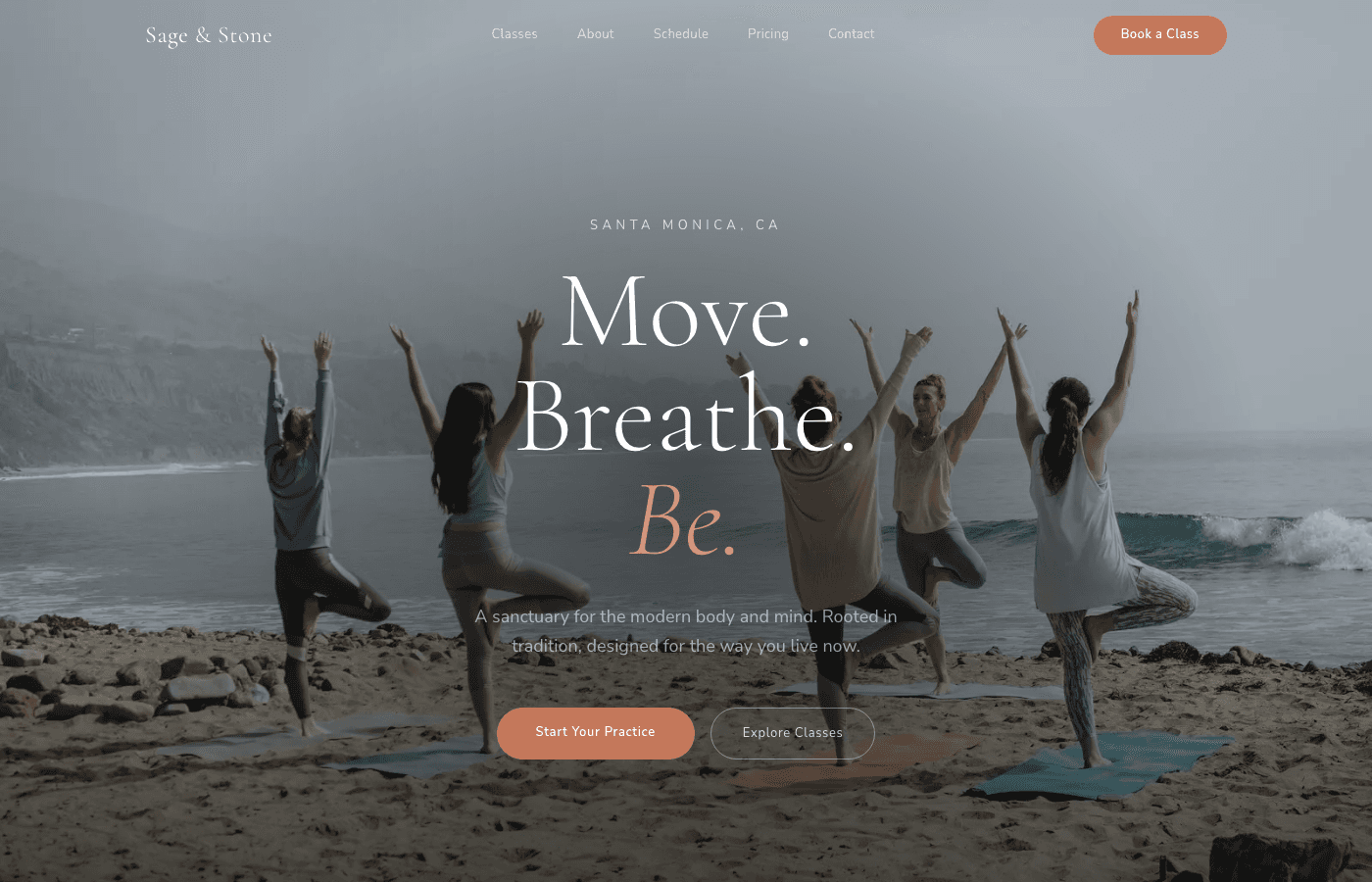
The hero needed to feel like stepping onto the mat — warm, grounding, and immediately calming. We built a full-bleed beach yoga image with a custom radial gradient overlay that draws the eye to the center. The "Move. Breathe. Be." headline in flowing Cormorant Garamond italic captures the studio's philosophy before the visitor even scrolls. Terra cotta CTAs anchor the composition with warmth.
Finding the practice
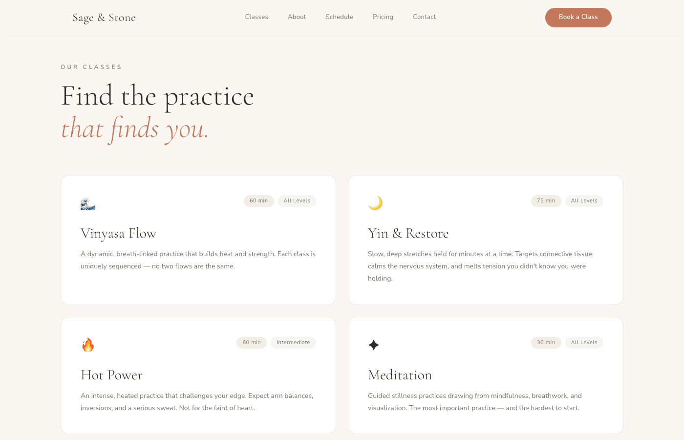
Each yoga style gets its own card with emoji identifiers, duration badges, and level indicators. Vinyasa, Yin & Restore, Hot Power, and Meditation are presented in a clean 2-column grid with hover states that invite exploration. The descriptions are honest and personality-driven — not generic studio copy. Visitors can feel the energy of each class before booking.
Building trust
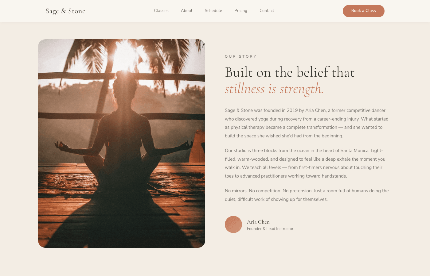
The about section tells founder Aria Chen's story — from competitive dancer to yoga instructor — alongside a portrait image in a rounded frame. The narrative is personal and specific, not corporate. "No mirrors. No competition. No pretension." The split-grid layout gives the story breathing room while the founder card at the bottom adds a human touch.
Designing the schedule
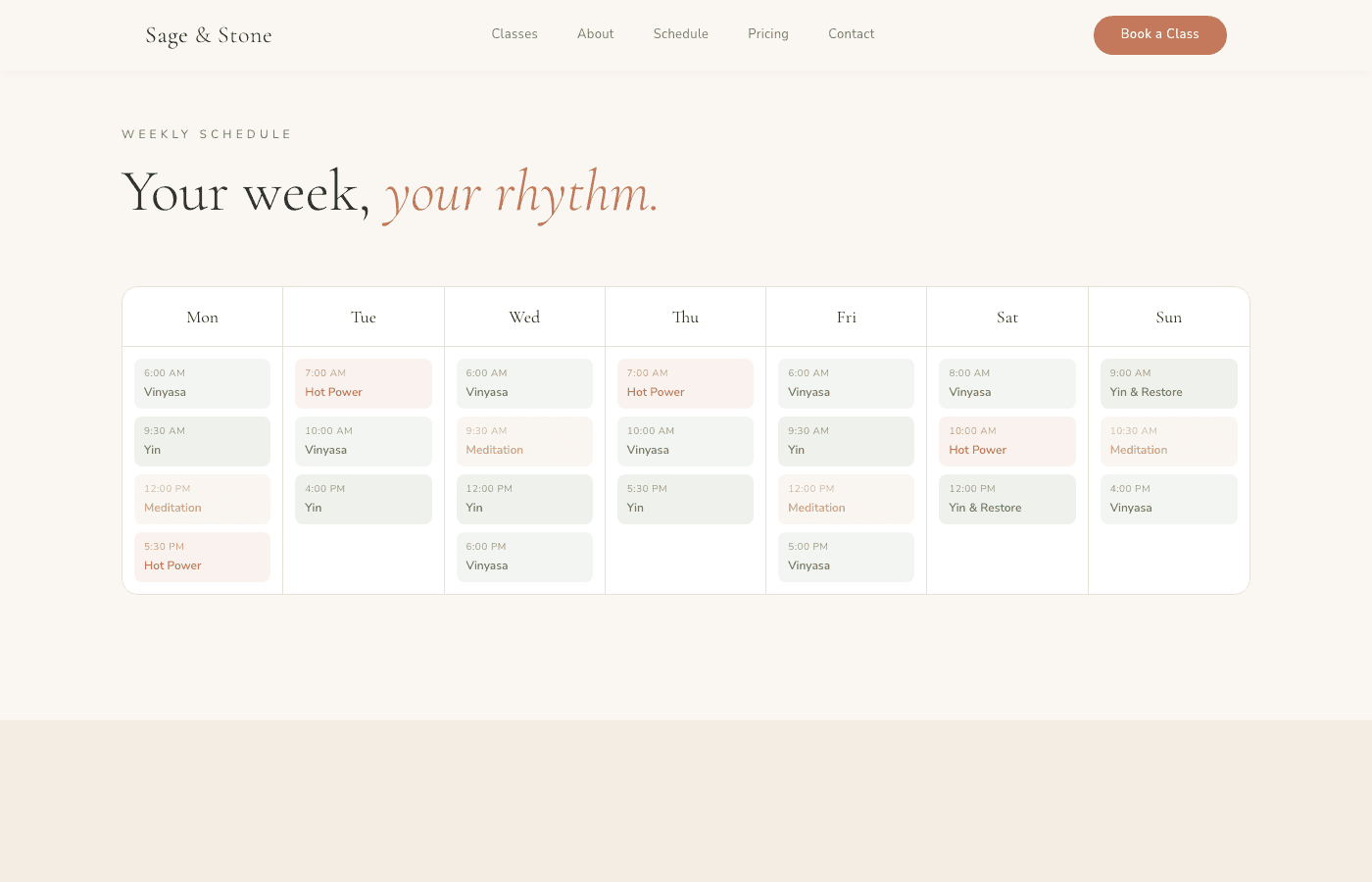
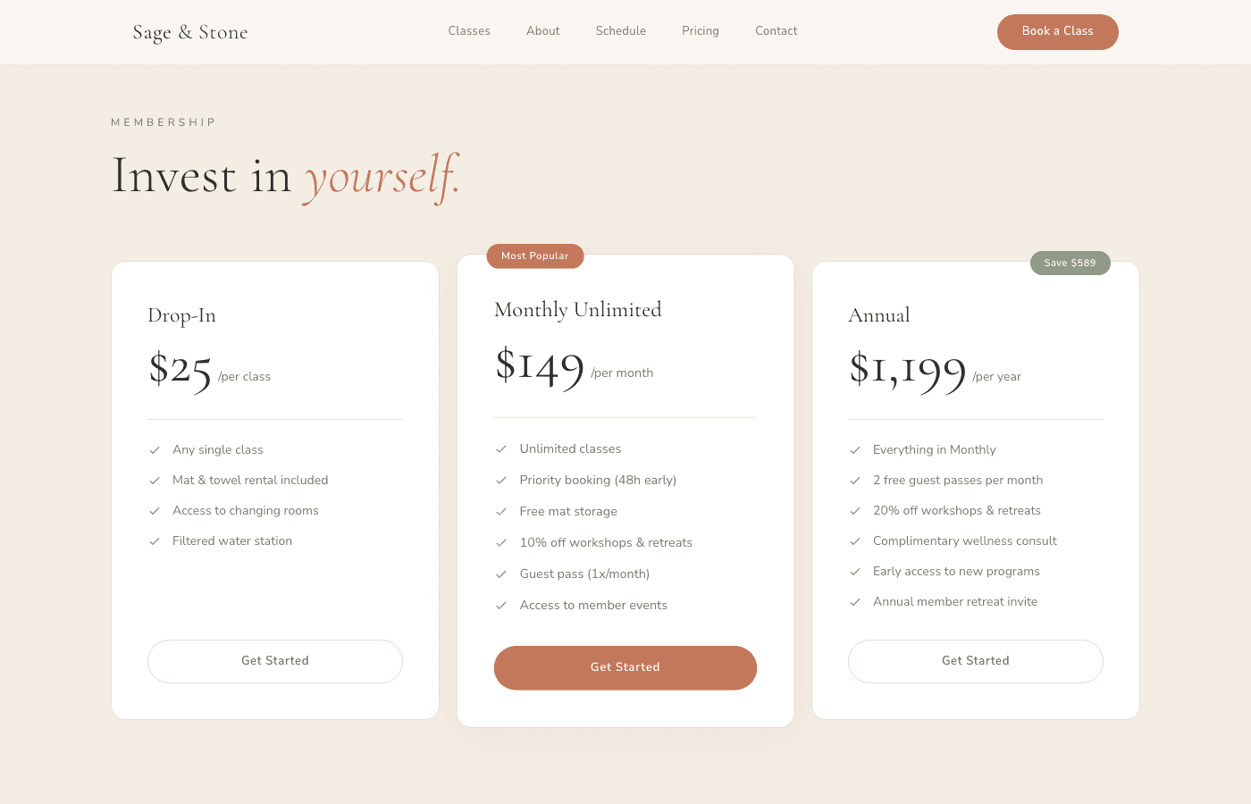
The weekly schedule is a color-coded 7-column grid where each class type has its own accent — sage green for Vinyasa, terra cotta for Hot Power, gold for Meditation. Below that, a 3-tier pricing section (Drop-In, Monthly Unlimited, Annual) uses card hierarchy with the popular plan elevated and highlighted. First class free — no friction to start.
Voices from the mat
The testimonials section features three member stories in warm cards with avatar initials and membership duration. Real quotes from real practitioners — Maya, James, and Priya — each telling a different story of transformation. Below, a 6-image Instagram grid connects the digital experience to the studio's social presence, with a follow CTA that extends the relationship beyond the site.
What we delivered
- Full custom Next.js yoga studio site launched in 1 day
- Beach-inspired hero with custom radial gradient overlay
- Class catalog, weekly schedule grid, and 3-tier pricing
- Mobile-responsive with warm, organic aesthetic
- Instagram integration and community-focused design
See it live
Explore the full Sage & Stone experience.